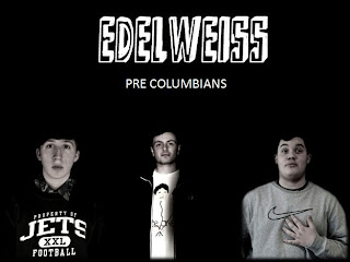
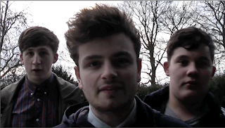
To get the black and white effect on the photographs for the album cover, I first took photographs of each band member invididually then on photoshop I edited then one by one. Above id a screen shot to show how I editied the brightness and contrast of the lead singer (Dec).
After that I selected image > adjustments > theshhold. With this effect the black and white cartoon appearence of the photograph is given. I have done this effect for the album cover because I think that it establishes the indie gypsy punk genre of their music and the quirkiness of the band. This process was done for each of the band members individually.
After I edited all three band members, I put the photographs all on a black photoshop document, this allowed me to assemble the band members together. I have done it so that the lead singer is in the middle and the drummer and the keyboard player is at side.
After assembling the band members together, I thought that it may need some colour seeing as one of the digi packs was completely black and white. I have done this by using paint and roughly selected the area that was white to a colour. Each band member is a different colour because I wanted them to have a colour which symbolised them. This is similar to the band called JLS where each band member has a different colour. Furthermore, I think that the rough colouring in of the band members is quirky and reflects the genre of their music. Moreover, I think that this photograph works well for the album cover because each of the facial expressions are black and they are looking at the camera. I do not think that this technique would have worked if the band members were smiling.


